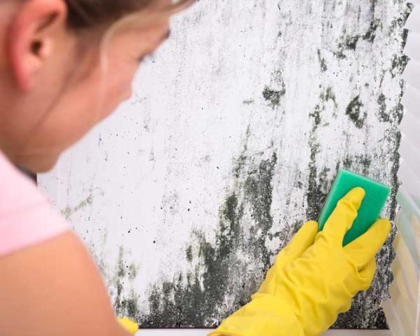
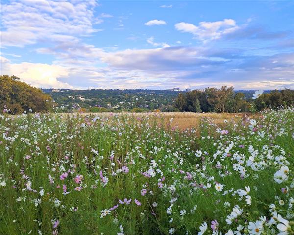
Douglasdale Property Market Update: What Sellers Should Know
Douglasdale covers approximately three square kilometres of former dairy farmland and has...
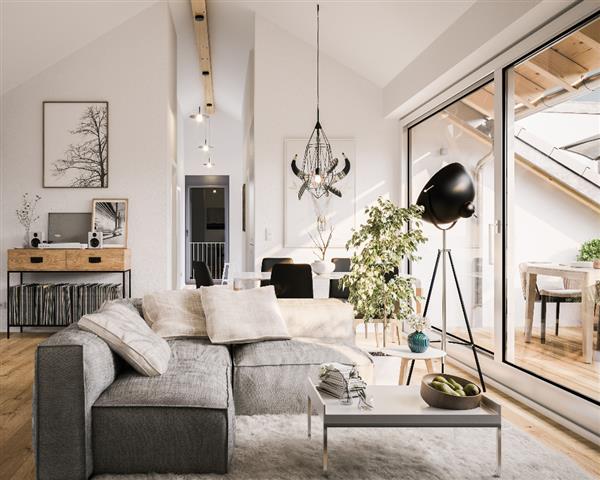
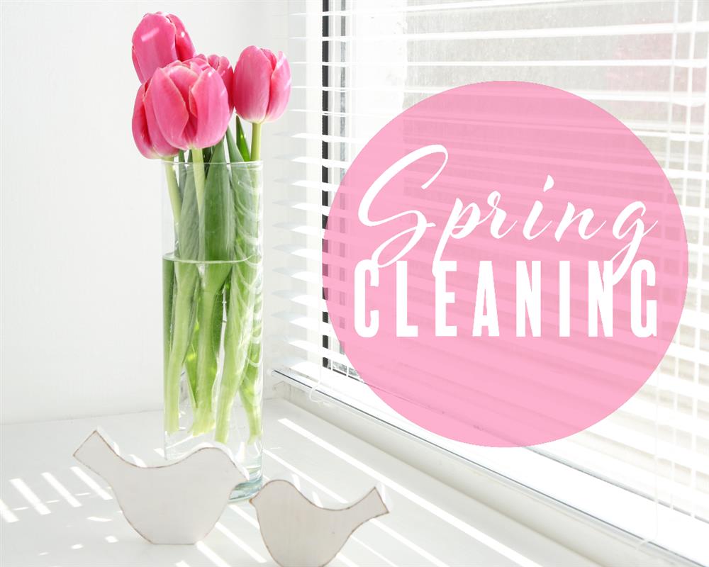
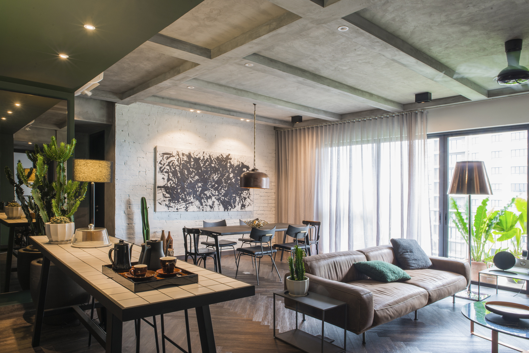
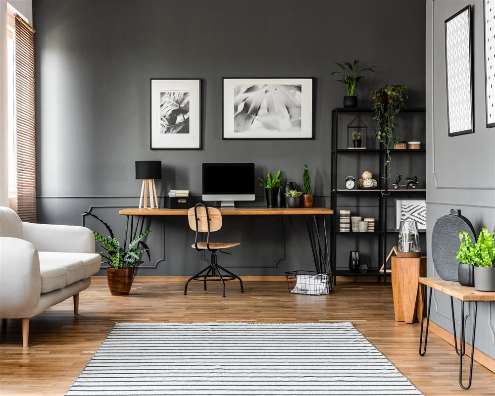
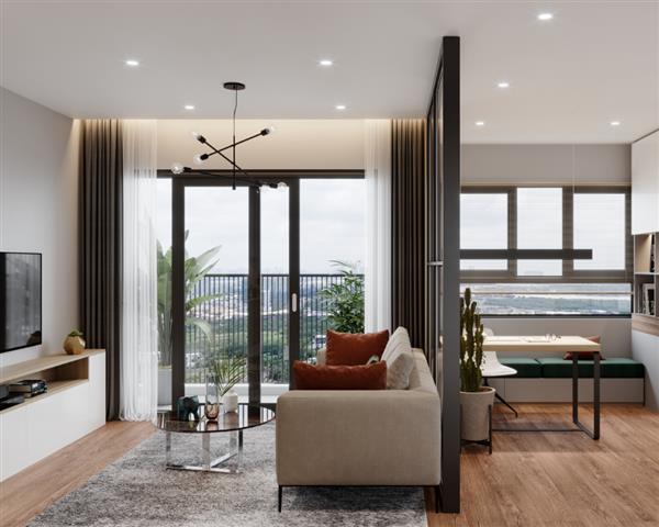
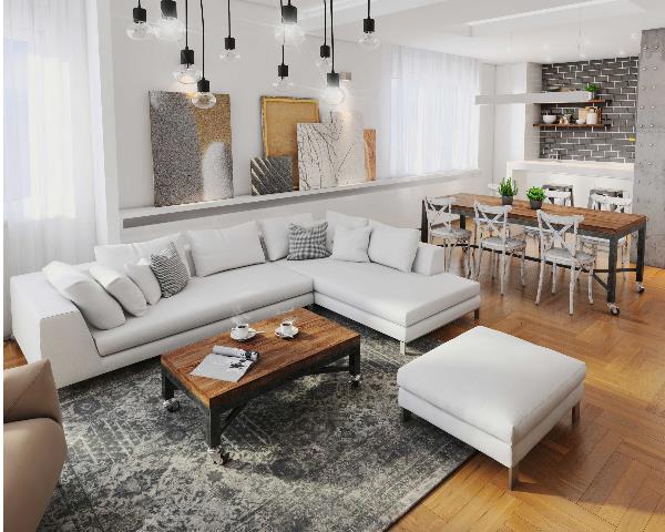
There are many ways to repurpose and reshuffle what you already own to refresh your home, without a tight budget getting in the way. When it comes to decorating, juggling quality, style and affordability may seem like an impossible task. We’ve assembled our three top tips for styling in Spring to transform your home.
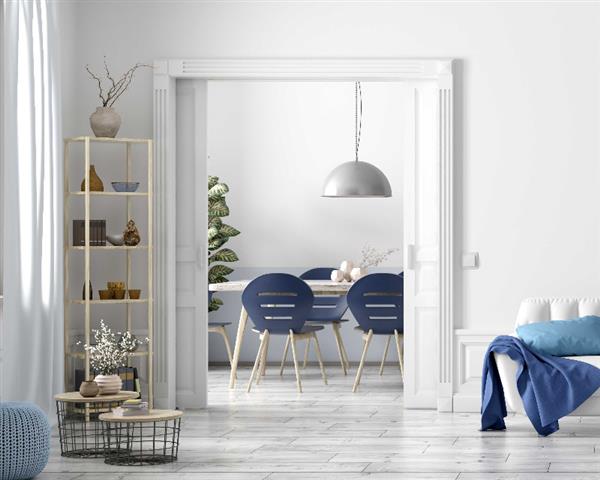
Rethink the Space:
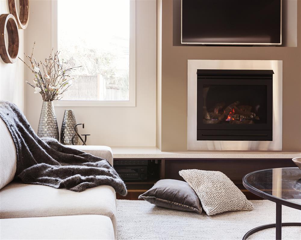
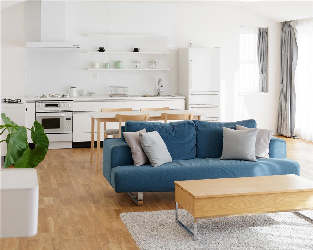
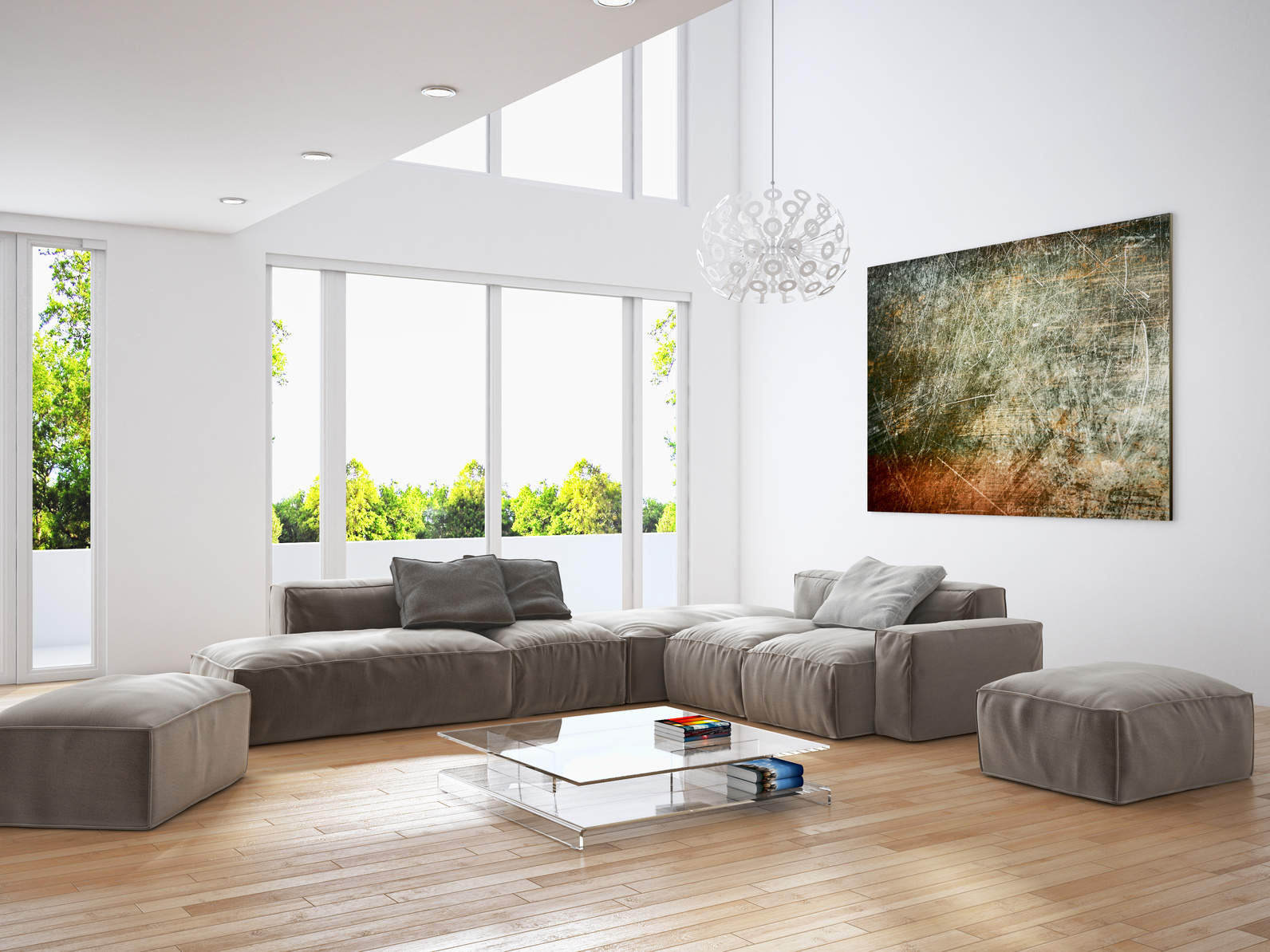
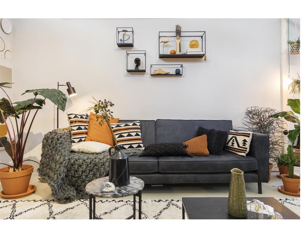
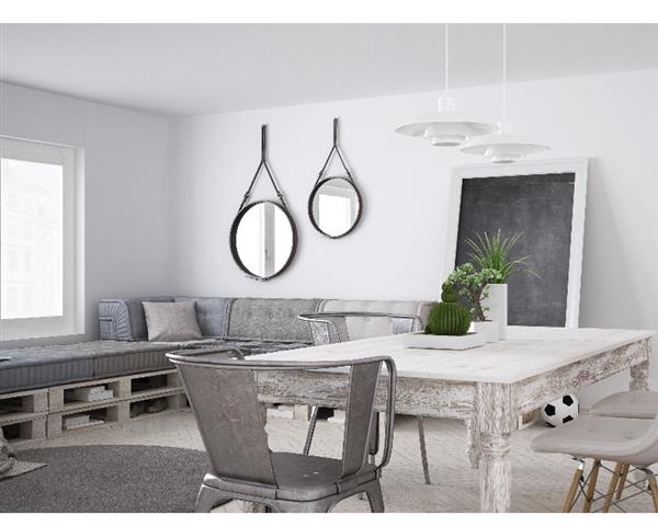
Perhaps the simplest of all décor hacks is this: rethink the space. For this to be effective, remove the furniture from the space and reimagine the living area entirely. Simply moving and removing furniture to better fit a space does wonders for the flow and feel of a home. Repurpose tabletop keepsakes from other rooms in the house, or simply shop your bookshelf for interesting books with statement imagery. When it comes to style that is both striking and understated, less is almost always more. Avoid cluttering tabletops with too many elements, instead use only accents and accessories that add to an uncomplicated aesthetic, and subtly highlight without distracting. Transform tired wooden furniture with a coat of fresh paint or reupholster chairs and sofas to add striking tones and textures to a neutral colour palette.
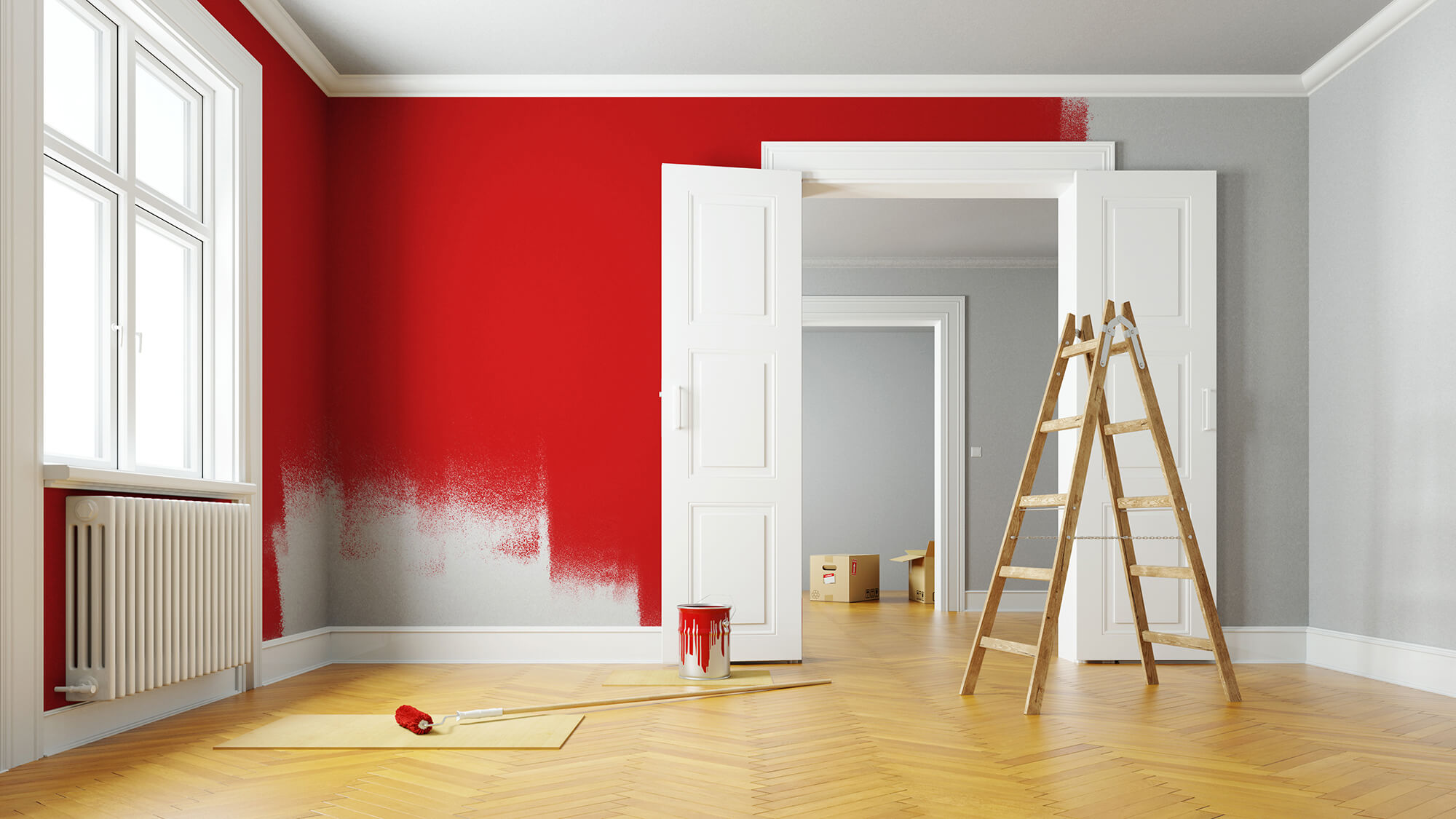
Pops of Colour:
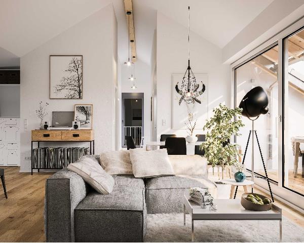
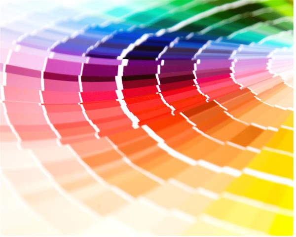
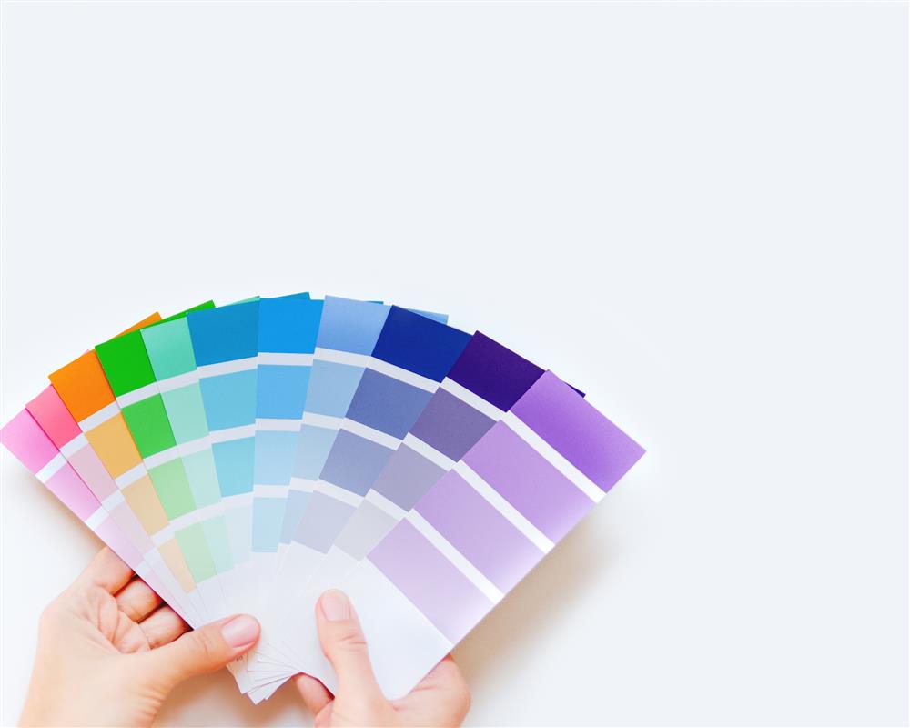
In line with 2021 décor trends, this simple, effective décor hack has the ability to revitalize a living space by simply incorporating pops of vivid colour or pattern play into the existing colour palette. Adding bright, bold accents is most effective on a neutral foundation where the colour du jour is most striking. Accents and accessories like scatter cushions, candles, lamps, towels, or occasional rugs are among some of the more cost-conscious additions to a neutral palette that are sure to give a tired room new life.
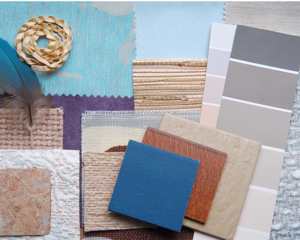
Consider incorporating the latest colour trends with Plascon’s Favourite Hue of 2021, Golden Syrup, and Pantone’s Colour of the Year, Illuminating. These joyful yellow hues embody warmth, optimism and indulgence – ideal for Spring styling - and complement the much-loved greys and neutrals that have dominated the design scene for a number of years.
For a more organic feel, various shades of verdant green have risen in popularity as a result of a growing move towards sustainable, low impact living and the hue’s association with wellness and nature. 2021 sees this versatile hue in all its shades and nuances as both a subtle neutral and a standout accent, incorporating a rich variety of shades by world-class colour experts – from Benjamin Moore’s Aegean Teal to HGTV Home's invigorating Cloverfields which forms part of their Delightfully Daring Color Collection. While gentle olive and pale jade evoke a sense of serenity and calm, rich emerald and dramatic deep forest are associated with opulence and revitalisation – translating into countless colour combinations, each evoking an entirely different experience, in any room and form imaginable.
Incorporating similar shades of the same colour throughout a room will create a sense of harmony and pull contrasting elements together. Whereas elements (scatter cushions or throws) that coordinate in colour but differ in texture lend a space a touch of playful creativity.
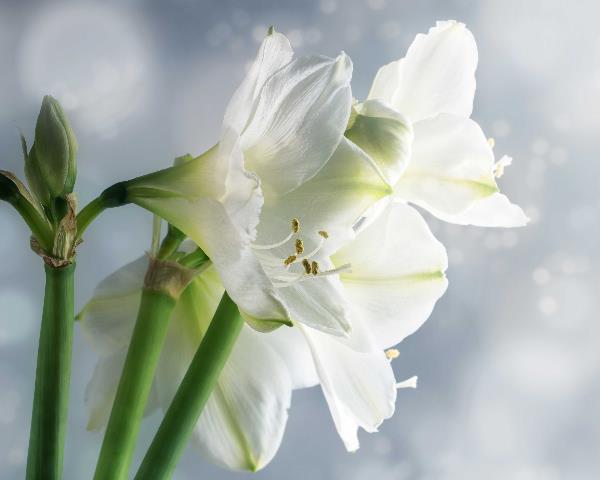
Accessorise with Fruits and Flowers:
Spring is the perfect time of year to augment your colour choice with accents from the grocery store or garden. Fruit and flowers are naturally vibrant and come in an assortment of shapes and colours, offering an inexpensive alternative to redecorating that would liven up any living space. Fruit and vegetables can be grouped according to size and colour and displayed on a kitchen counter or dining table as a simple statement piece that packs a punch. For example, a fruit bowl of deep red apples, pomegranates and plums or a hurricane vase filled with fresh lemons and limes. Alternatively, an arrangement of fruit in contrasting colours and shapes may be strategically positioned to highlight distinctive pieces of furniture or fill an otherwise empty space. Even a singular perfect fruit atop a pedestal, artfully positioned, creates subtle visual interest without overwhelming or crowding the surrounding space.
"We always say in design: when you want to add life to a room that's feeling too stark, add a plant," says Sue Wadden, director of colour marketing for Sherwin-Williams. Plants and florals are among the easiest elements to style a home with, particularly in Spring when gardens are lush with fresh blooms. When selecting flowers choose colours that compliment or contrast the existing colour palette, depending on the mood, room and overall styling outcome desired. The choice of colour may be used to pull various design elements together to create a sense of harmony and balance, or simply to give a room a shock of colour. Flower arrangements may include magnificent displays of a variety of flower species or a single bright bloom in a simple glass vase. Due to the abundance of colours, shapes and sizes available, interior designers believe that at the very least each room should boast one plant or floral.
With the colour green a top trending hue, indoor plants and trees are an ideal way to enhance a living space in Spring - bringing pops of rich colour, organic shapes, and unique texture to empty corners and countertops, while simultaneously drawing the natural world indoors and creating spaces that enrich the soul and revitalise the mind. Consider combining a mix of fruit and succulents for an interesting centrepiece that is sure to have your guests gawking.


![What is POPIA? [Part 1]](https://s3.entegral.net/news/Thumbnail_2021_10_18_11_53_39_403.jpeg)