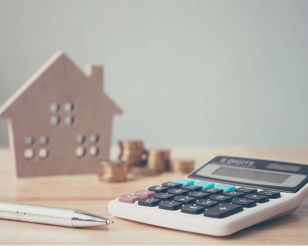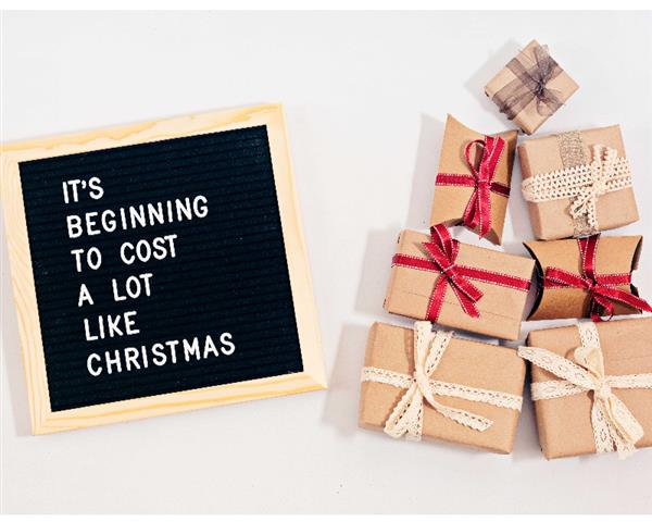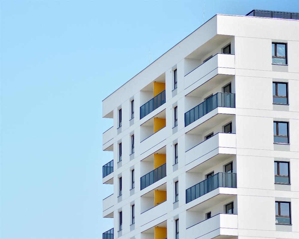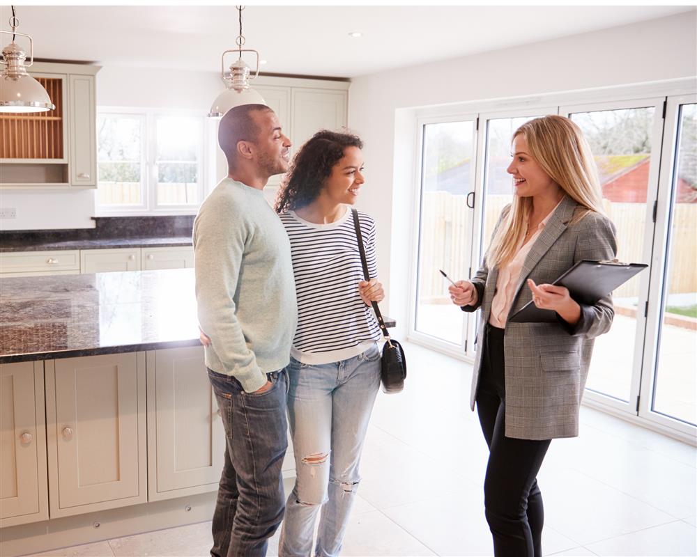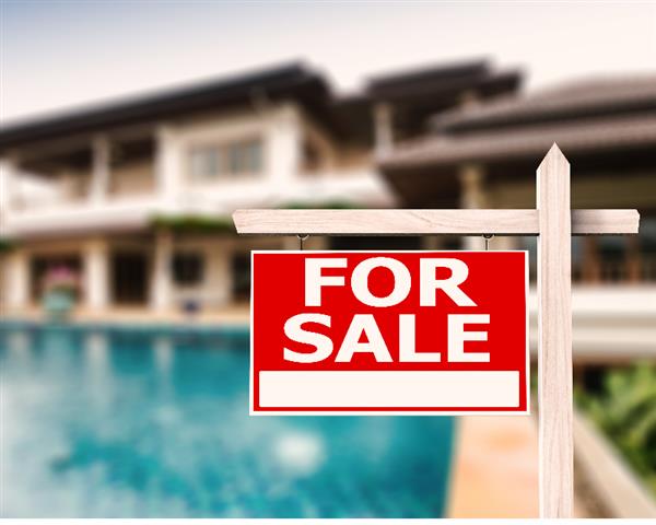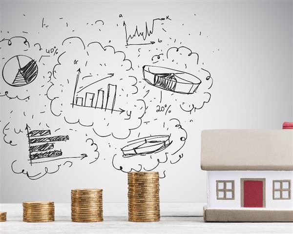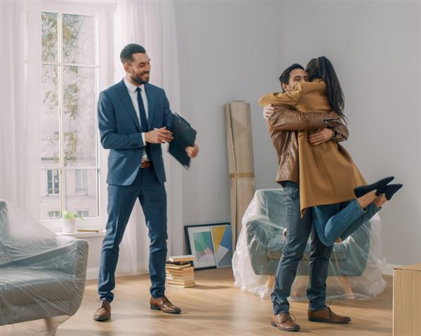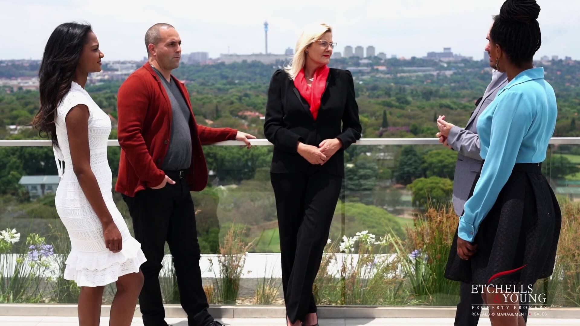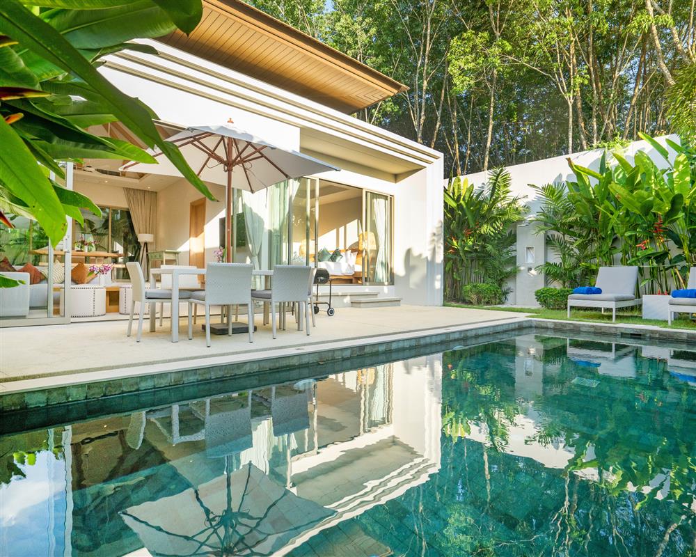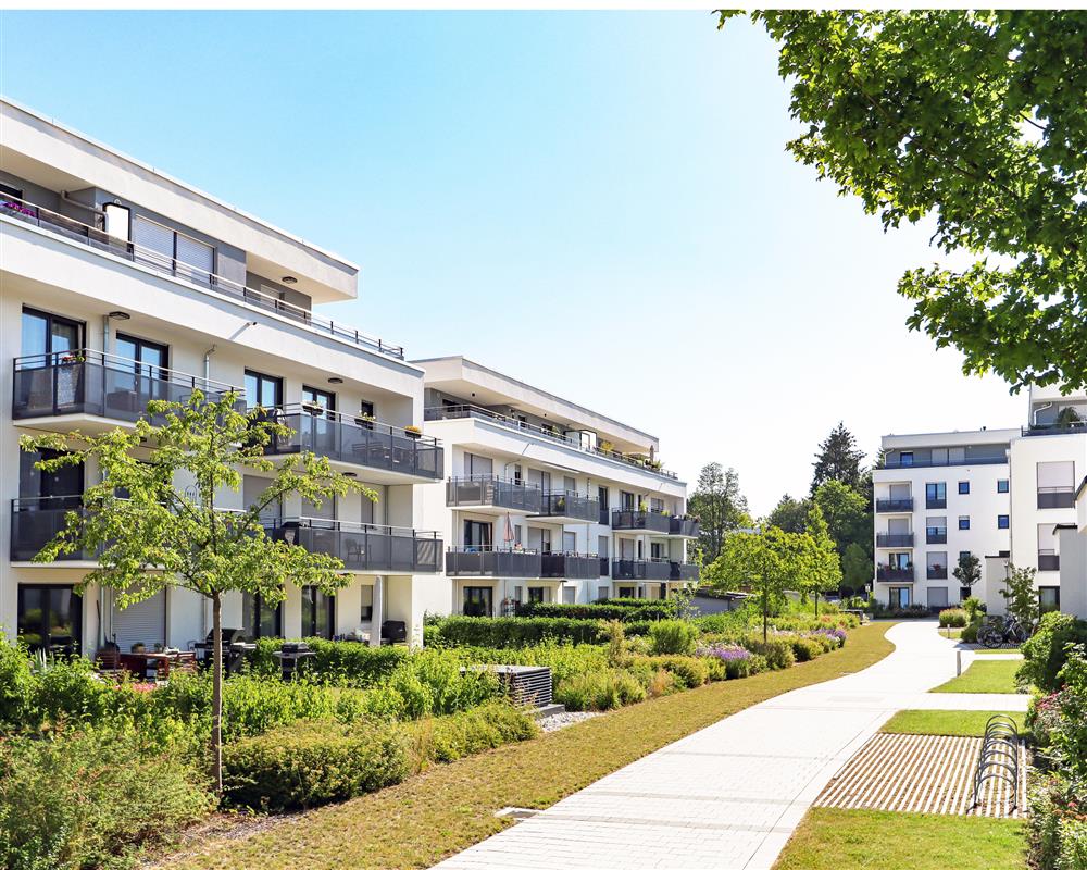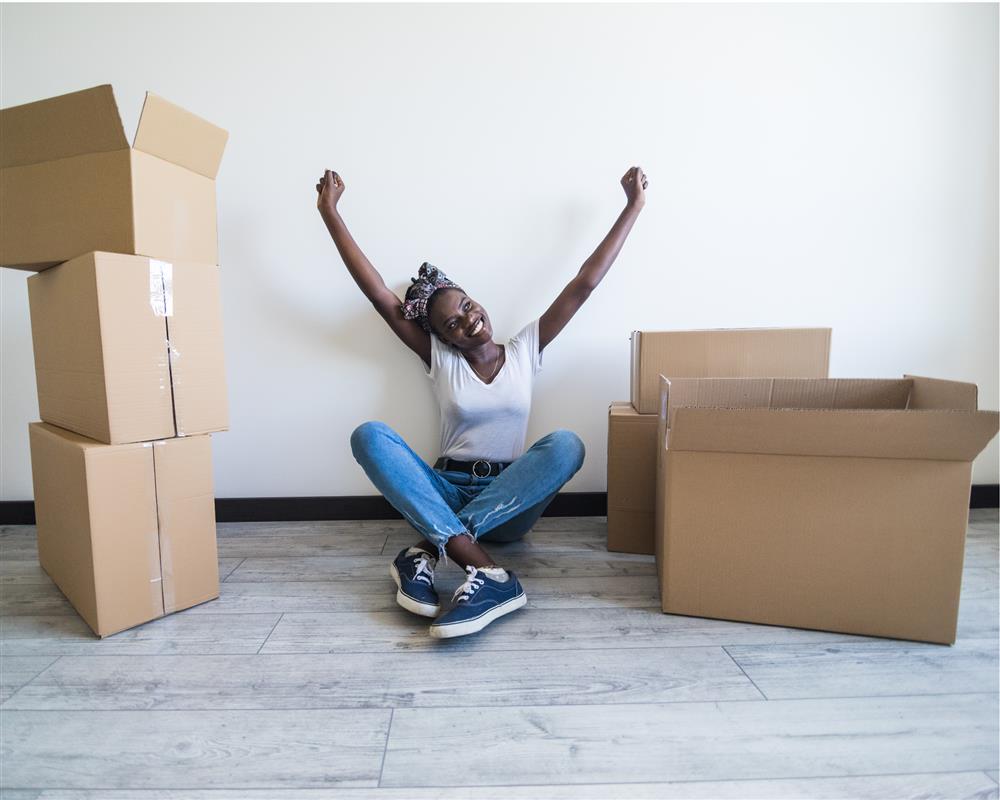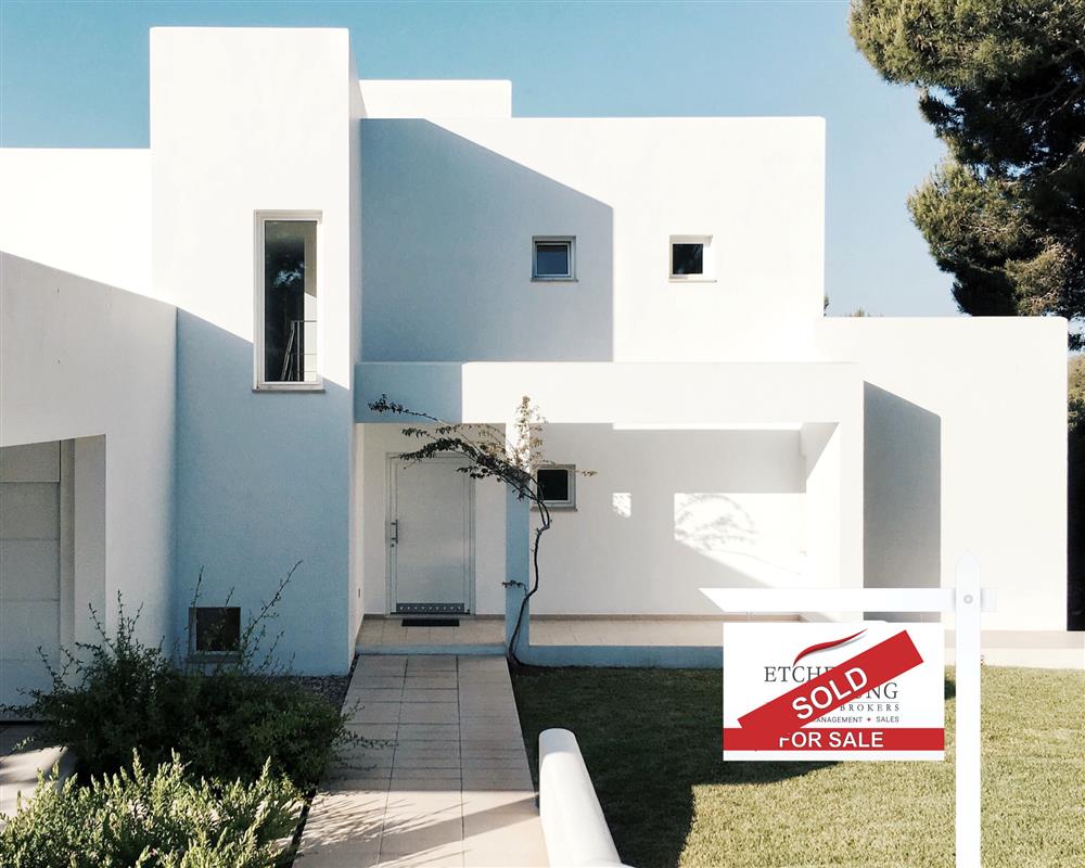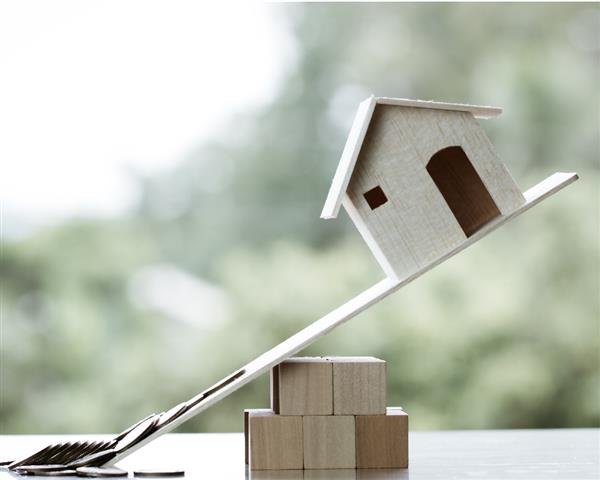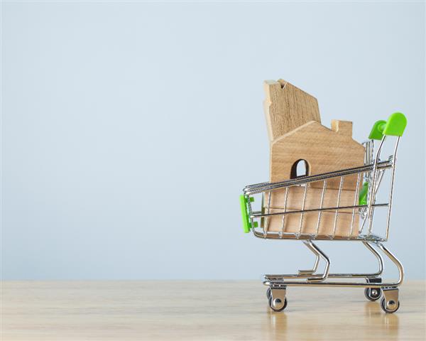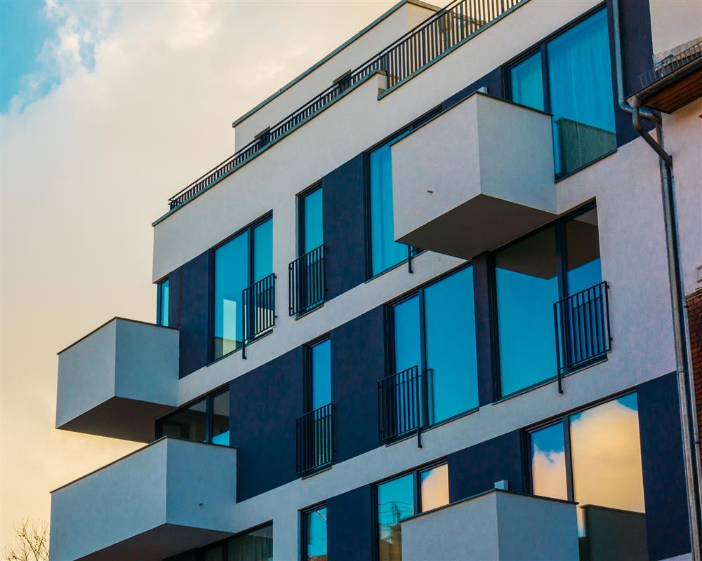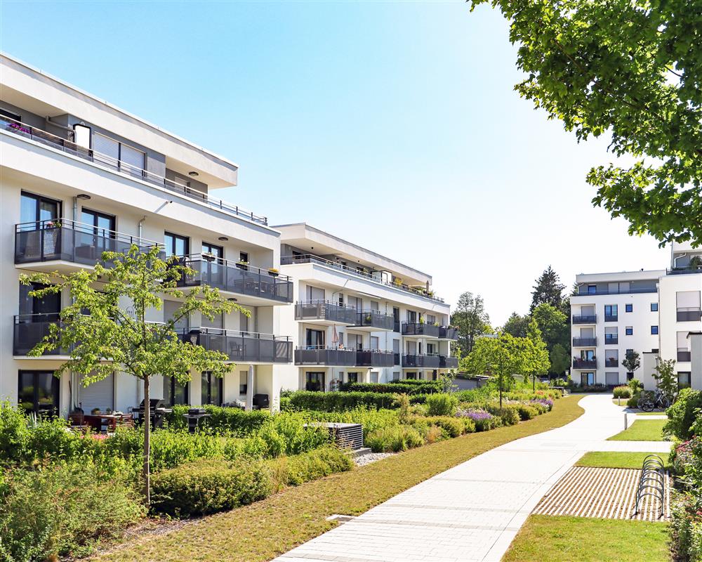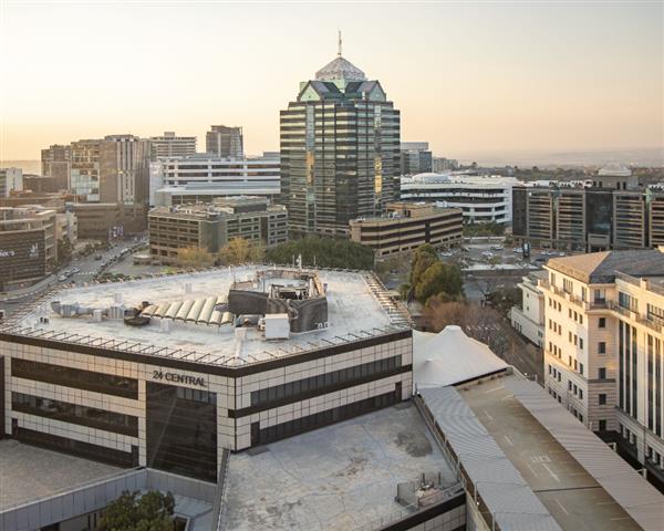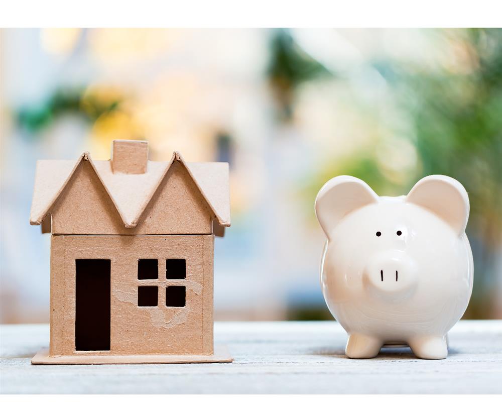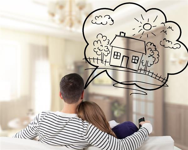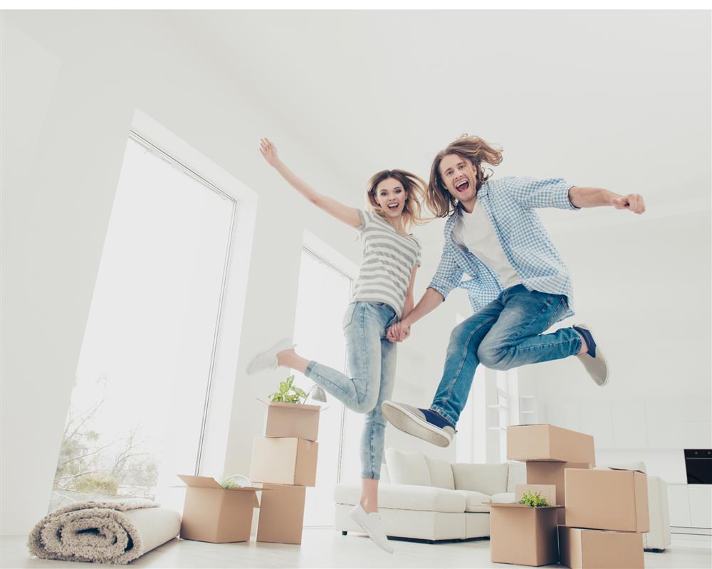
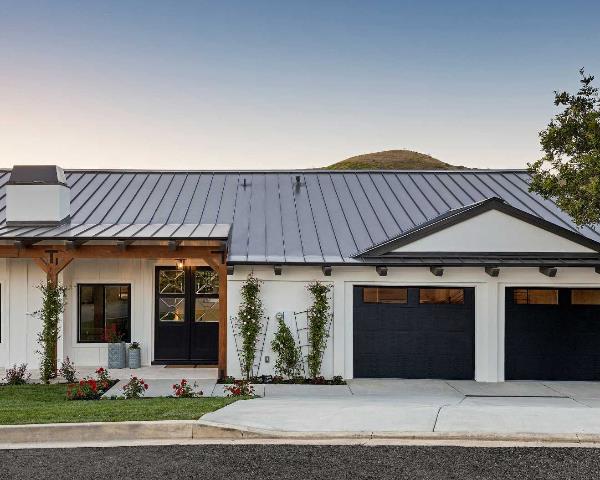
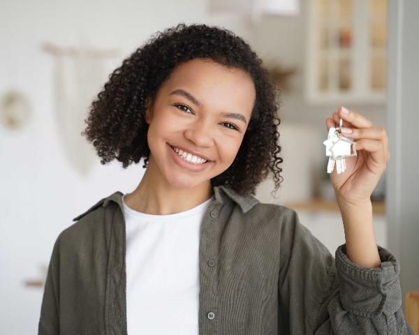
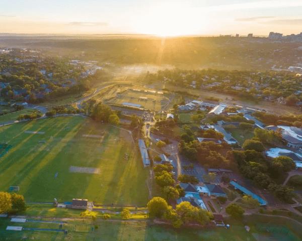
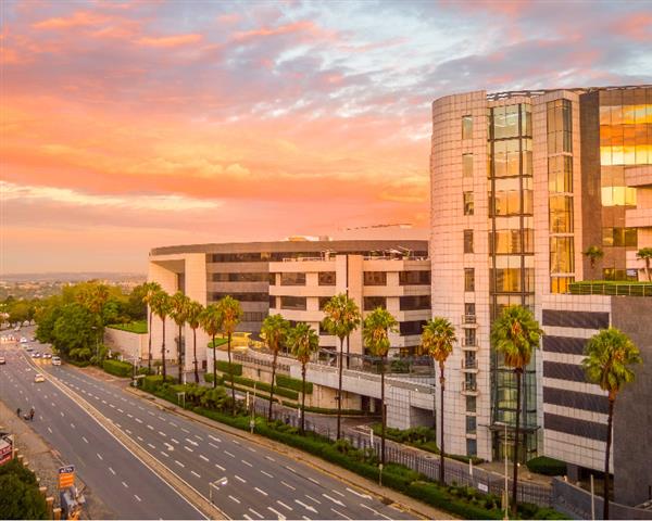
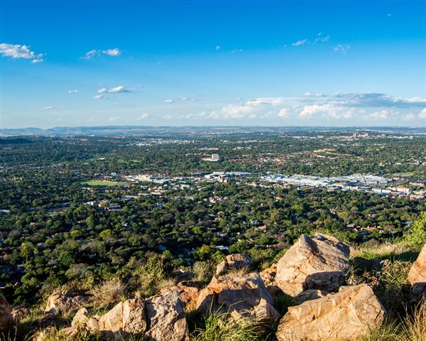
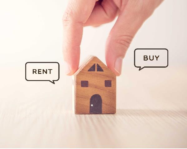
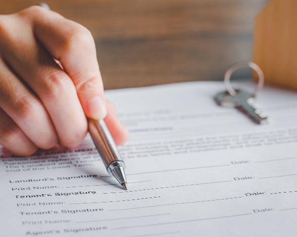
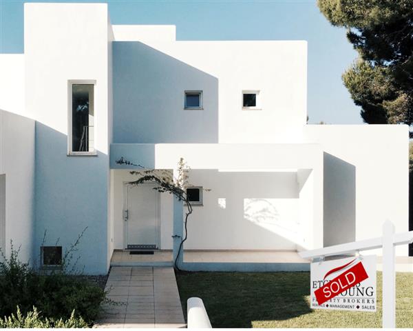
What Reverse Semigration Means for Gauteng Property Owners
For several years, the semigration conversation in South Africa has largely focused on peo...
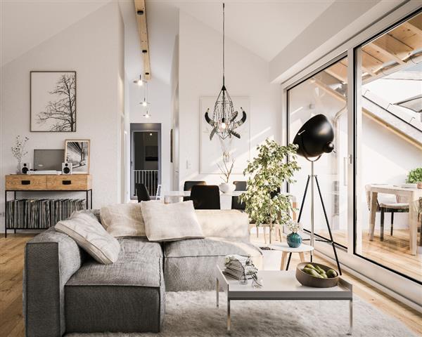
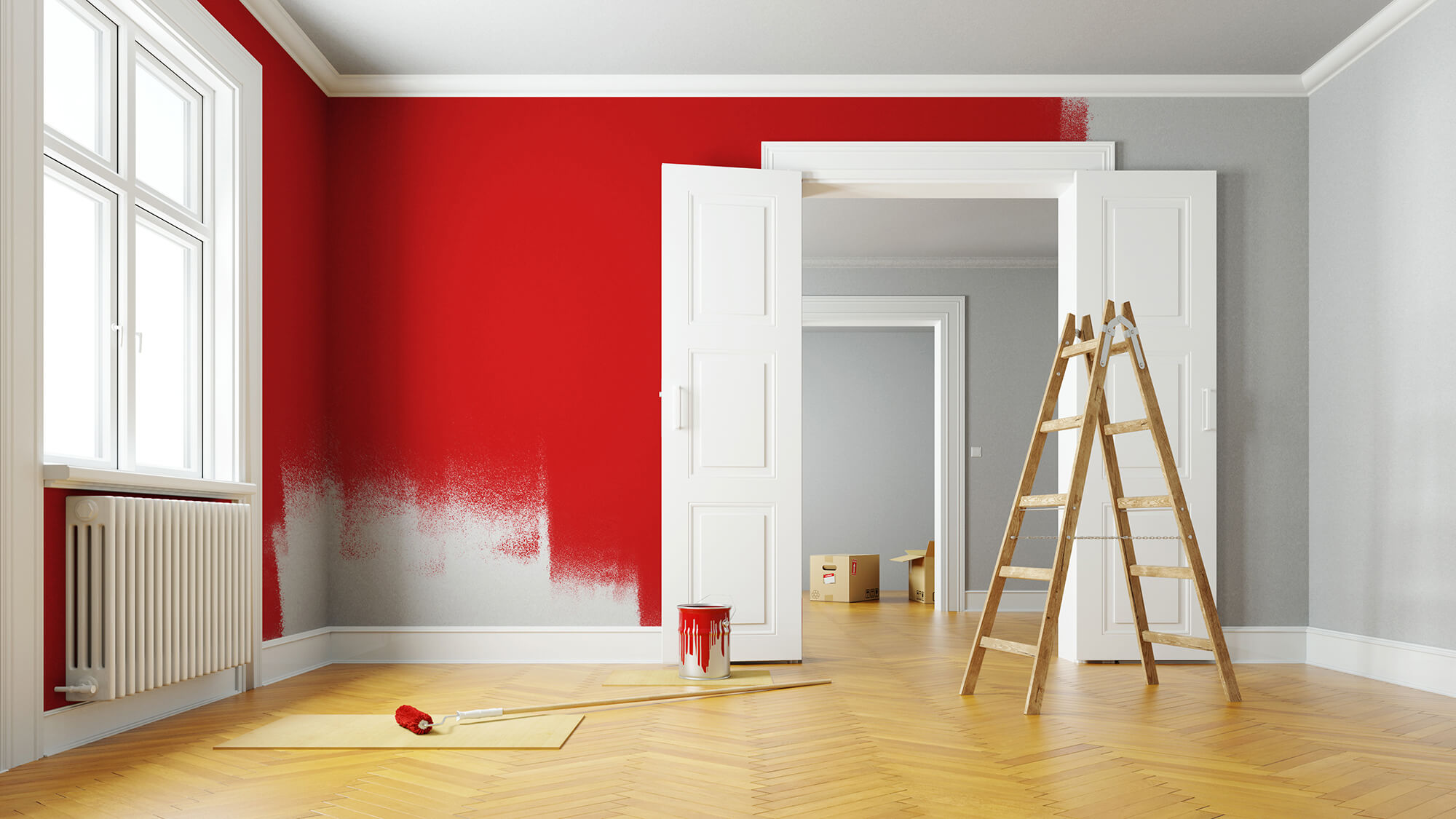
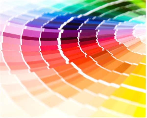
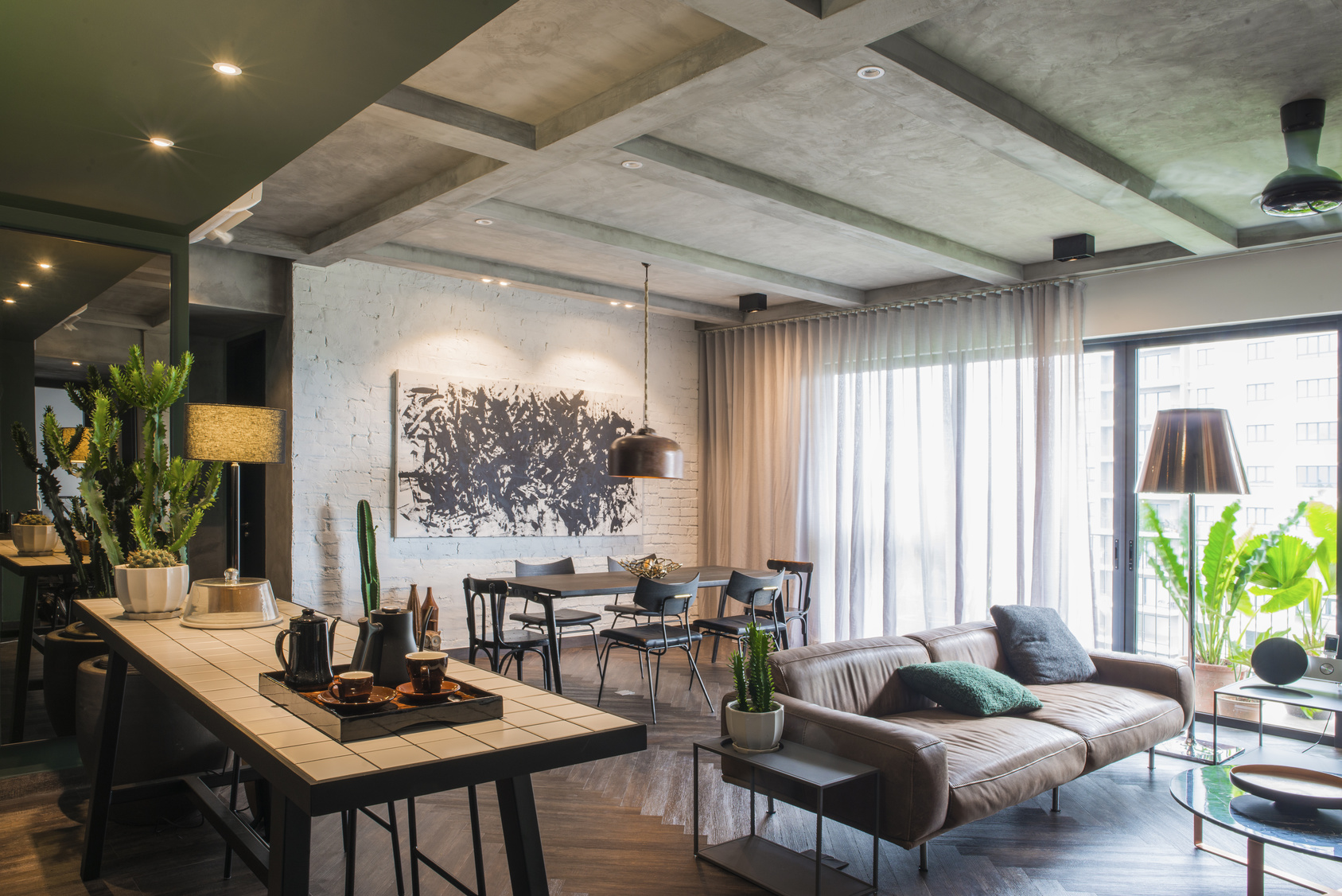
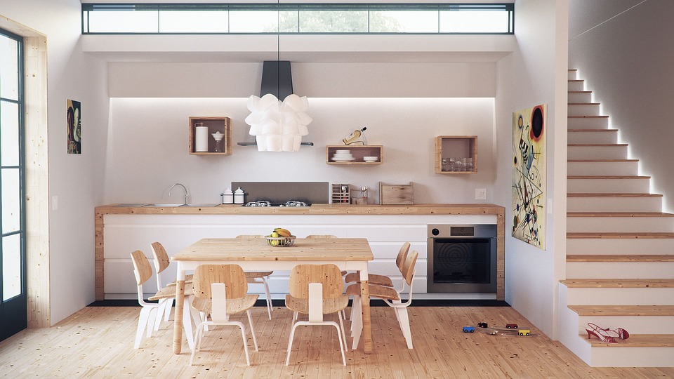
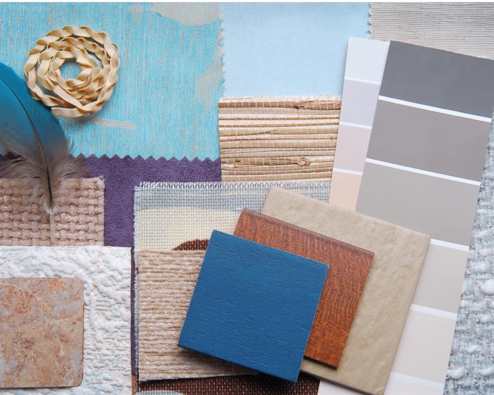
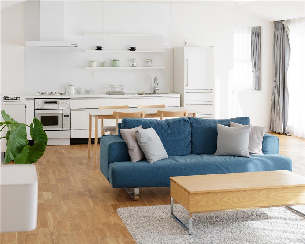
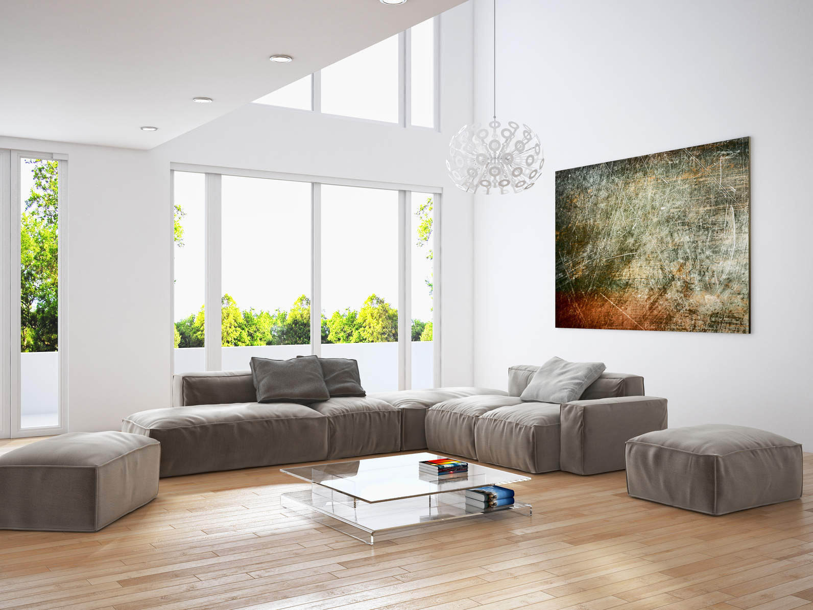
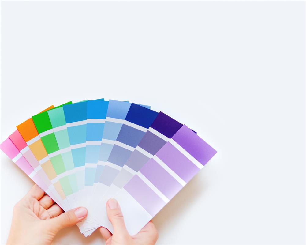
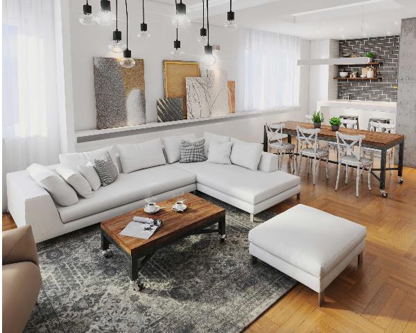
Plascon published their annual Colour Forecast for the New Year, and the remainder of 2017 promises to be an enigmatic mix of colour and design! Simplicity and balance have notable influences in the layout and design anticipated for 2017, and inspiration comes from both local and international sources, with a combination of digital, cultural and natural elements emerging in current decor trends for the home and workspace.
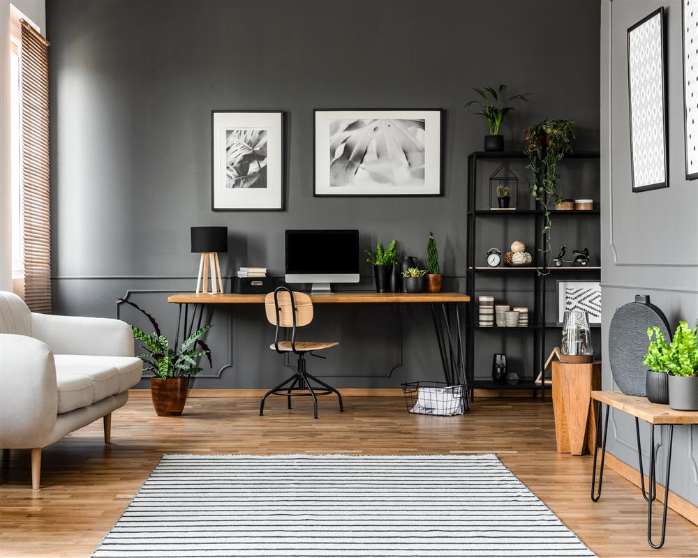
The Colour Forecast has highlighted four pivotal colour themes that evoke a sense of warmth and sophistication through the use of colour, space and accessories. This year sees a move towards minimalism and a neutral colour palette, accentuated by soft pastels or rich saturates. Each theme is anchored by cool grays and mineral midtones, emphasising balance and permanence.
Although subtly different, each colour trend achieves a greater sense of home through its use of tonal effects and design elements; seamlessly blending modernity, sophistication, elegance and harmony.
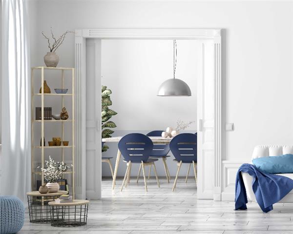
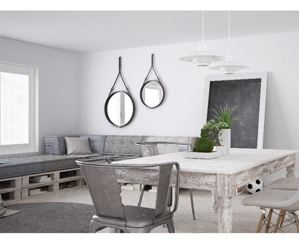
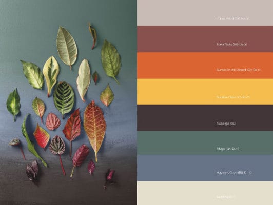
Colour Story One: Anonymous
“Anonymous’ clear and clean palette is designed for ease of use with a range of cool neutrals anchored with expressive darks and enlivened with dreamlike accents.” Minimalist Unobtrusive Unassuming Tranquil Dream-like Irridescent Soft Pastels Cool Neutrals/Grays Gradient Paint Effects Feature Colour Block Soften Tonal Effect Metallic Highlights High-Gloss Reflective Surfaces Mirrors Matte Finishes Blackened Undertone
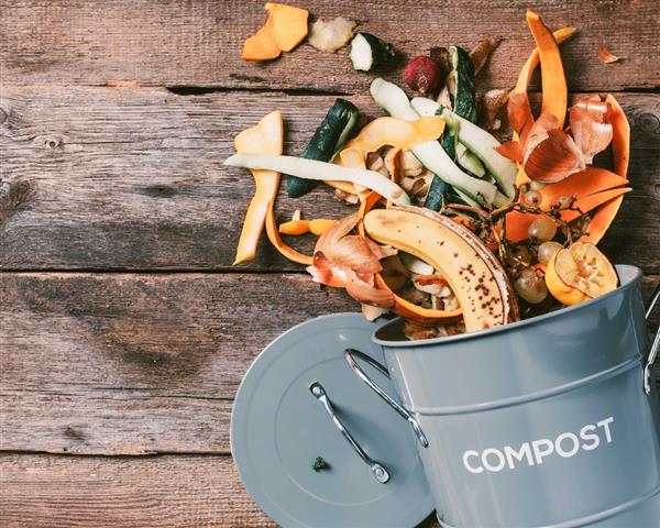
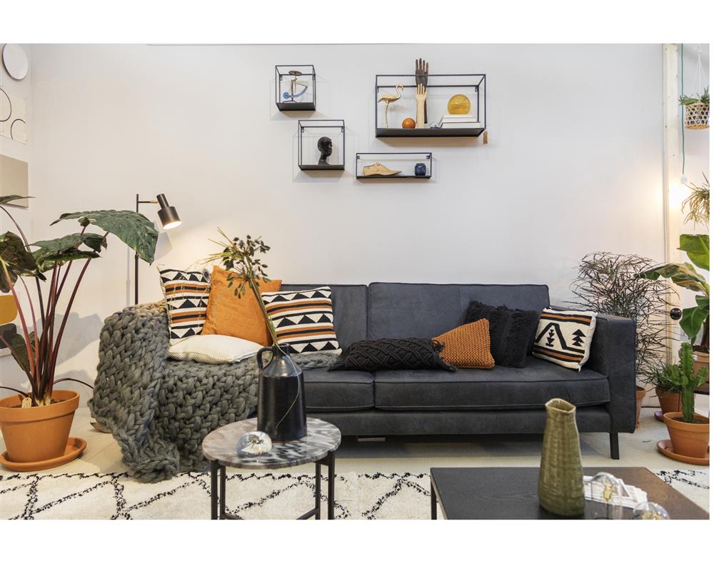
Colour Story Two: Terrain
“Rich and multi-layered, Terrain draws inspiration from the warm earth and the topography of the natural world while relishing the security of the hearth and home.” Authentic Unpretentious Harmonious Earthen & Natural Tactile Warm Tonal Combinations Saturated, Contrasting Colours Highly-Pigmented Mineral Tones Textured Luxurious Graphic Detailing Leather, Stone, Wood Cool, Dark Backdrops Hand-Crafted Accents Graphic Use of Lines & Colour Enlivening Botanicals
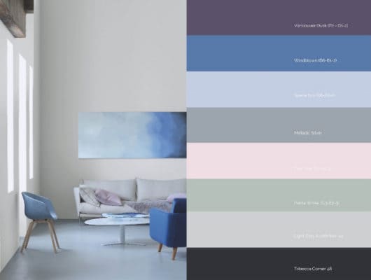
Colour Story 3 : Prism
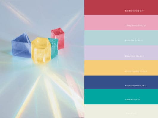
“Layered, linear and graphic patterns have a sense of dynamic motion and are shown to best effect on a silent, sympathetic scape.” Sophisticated Modern Harmonious & Energising Kaleidoscopic Three-Dimensional Spectral Clean Lines Digital Graphic Geometric Blocks Layered, Linear Patterns Dynamic Motion Colour Zoning Cool, Light Pastels Vibrant, Saturated Features Complementary Colours Transparent Acrylics Tonal Gradients Glass Textile Prints & Accessories.
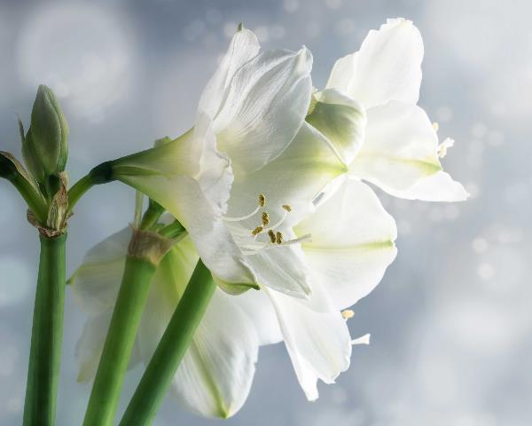
Colour Story 4 : Pause
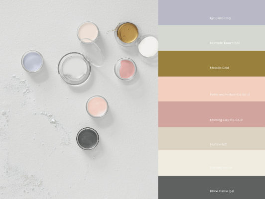
“The mood is monastic without austerity; tactile unadorned finishes and humble scapes are bonded with a raw, powerful yet elegant gilded metalli.” Authentic & Raw Balance & Harmony Sanctuary Sophisticated Tonal Simplicity Delicate Touches of Deep Gray Luxurious Metallic Gold Meditative Neutrals Gossamer Textures Humble Textiles Tactile, Simple Fittings Cool Light & Shadow Calming Blues & Soft Pink Hues Pale Clay Tones Bleached Wood & Linen Light
"Color does not add a pleasant quality to design - it reinforces it." Pierre Bonnard
lascon Colour Forecast 2017 www.plascon.co.za/colour/forecast.asp Images sourced from Retrieved 29 March 2017


![What is POPIA? [Part 1]](https://s3.entegral.net/news/Thumbnail_2021_10_18_11_53_39_403.jpeg)